AdCreative
Performance / Campaign Assets
Why Authority Validation
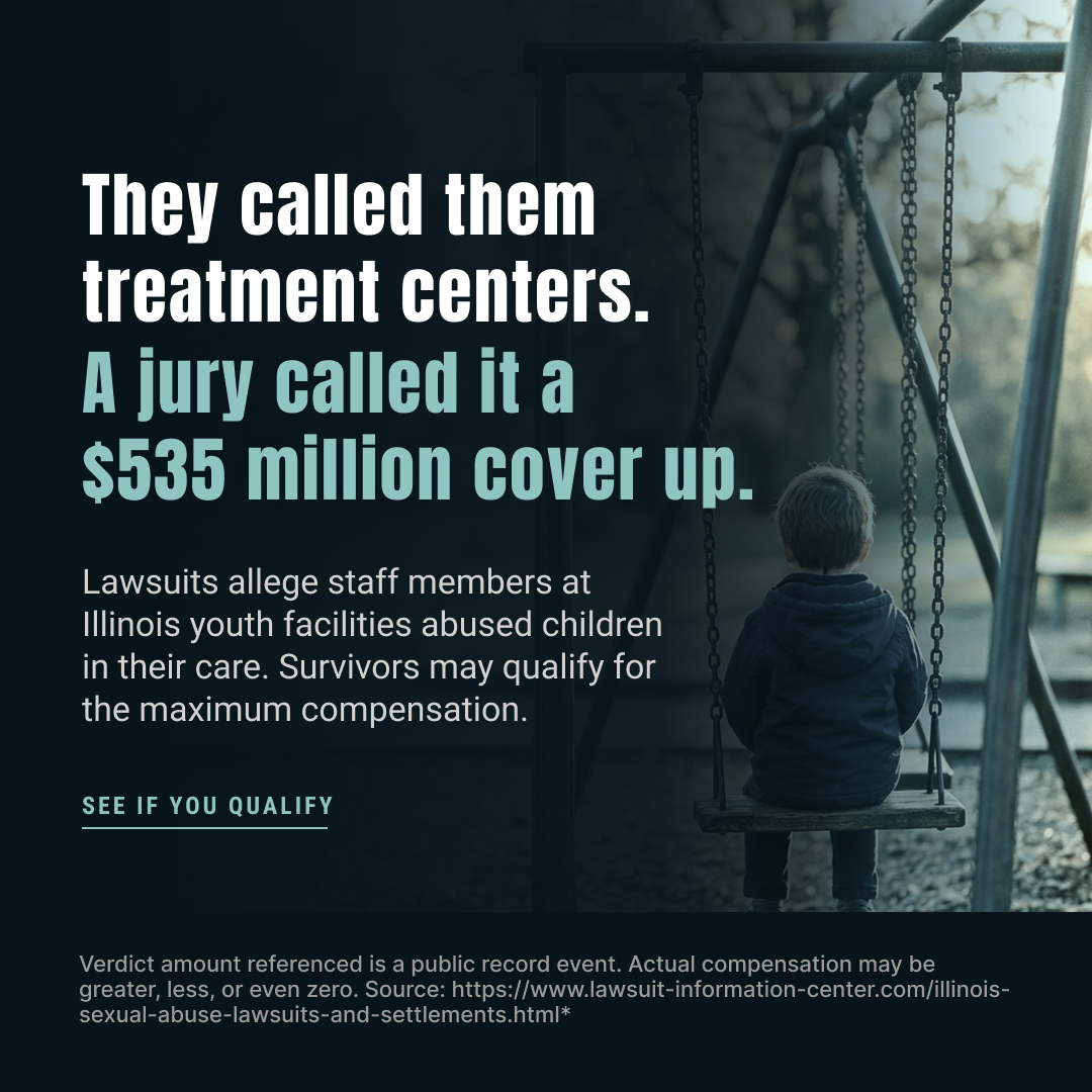
Legal ads get scrolled past. News broadcasts get watched. This angle wraps the message in a news-broadcast aesthetic, format-based trust transfer. The viewer processes it as a report about something happening in Illinois, not as an ad. By the time the content registers, they've already assigned credibility to it.
Headline → Subheadline → CTA
The headline exploits contrast between the institutional label and the jury's verdict. Quiet anger, not shock. Allegation framing ('lawsuits allege') maintains compliance without losing emotional weight. The CTA is intentionally low-pressure, 'see if you qualify' is informational, correct for a top-of-funnel survivor persona who hasn't self-identified yet.
Design Decisions
Desaturated blue/teal grade keeps the image still and heavy, not alarming. Child on an empty playground seen from behind: melancholic without being exploitative. Text anchored left, subject positioned right, hierarchy reads in under a second at thumb-stop speed. White text with drop shadow prioritizes legibility over style.
Static (Standard)
Text-led static. Three zones, one focal point each: headline stops the scroll → image carries the emotion → CTA closes. Built for 1:1 feed and 9:16 story, with 40px safe margins and attorney disclaimer in the footer strip. Widest reach of any format at top of funnel, stops people who would never click a legal ad but will pause for a news story.
Why Injury First
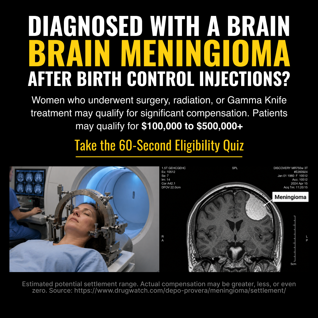
No angle guessing needed, if you've had a Gamma Knife procedure or seen a meningioma on an MRI, you recognize this immediately. The injury-first approach skips awareness entirely and drops the viewer into the moment of diagnosis. The visual creates recognition before the copy is even read.
Question Hook → Treatment List → Value Anchor
The question headline ('Diagnosed with a Brain Meningioma After Birth Control Injections?') does the qualifying work before the viewer consciously decides to engage. The subheadline layers in three specific treatment types, surgery, radiation, Gamma Knife, making self-selection automatic. The dollar range anchors perceived value without guaranteeing an outcome.
Design Decisions
Split bottom zone: Gamma Knife helmet on the left (procedure proof), labeled MRI scan on the right (diagnosis proof). Not stock, not staged, clinical imagery the target audience has lived through. The 'Meningioma' tag on the scan is the critical identification trigger; must be legible at mobile size. Dark background + bold yellow headline signals clinical urgency, not a legal ad.
Static (Standard), Image-Led
Bold text-heavy top zone stops the scroll with the question hook. Split clinical imagery fills the bottom zone equally, both images earn their space by triggering recognition, not emotion. Three zones, one purpose each. Built for Meta Feed and Stories targeting women 30–55. No product name anywhere per compliance requirements.
Why Official Authority
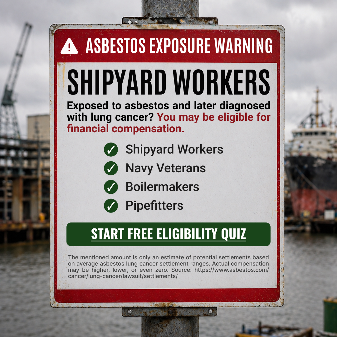
Men 60–80 in industrial trades recognize workplace hazard signage from their working years. The official authority angle bypasses ad skepticism entirely, the viewer processes this as a safety notice meant for him, not as someone trying to get him to click. Occupation identity triggers self-selection before any copy is read.
Warning Banner → Occupation Hook → Checklist
The 'ASBESTOS EXPOSURE WARNING' banner primes the viewer before the headline. 'SHIPYARD WORKERS' as the headline does immediate qualification, only the right person reads past it. The four-occupation checklist (Shipyard Workers, Navy Veterans, Boilermakers, Pipefitters) is a self-identification list, not a description. Green CTA contrasts cleanly against the sign's red-and-white aesthetic.
Design Decisions
The sign is the ad. Mounted on a weathered metal post, photographed against a desaturated shipyard background, feels documented, not designed. Red border and top banner carry the warning association from decades of safety culture. White sign body maximizes legibility. The post visible at the bottom grounds the image in a physical, real-world context that the persona recognizes.
Static (Standard), Image-Led
Sign occupies the majority of the frame; background is atmosphere, not content. Three zones: warning banner and headline stop the scroll → sign body with checklist pre-qualifies → CTA button closes. Blue-collar, no-frills aesthetic matches the demographic, this should feel like workplace signage from his era, not modern social media design.
Social Proof + Authority, News Format
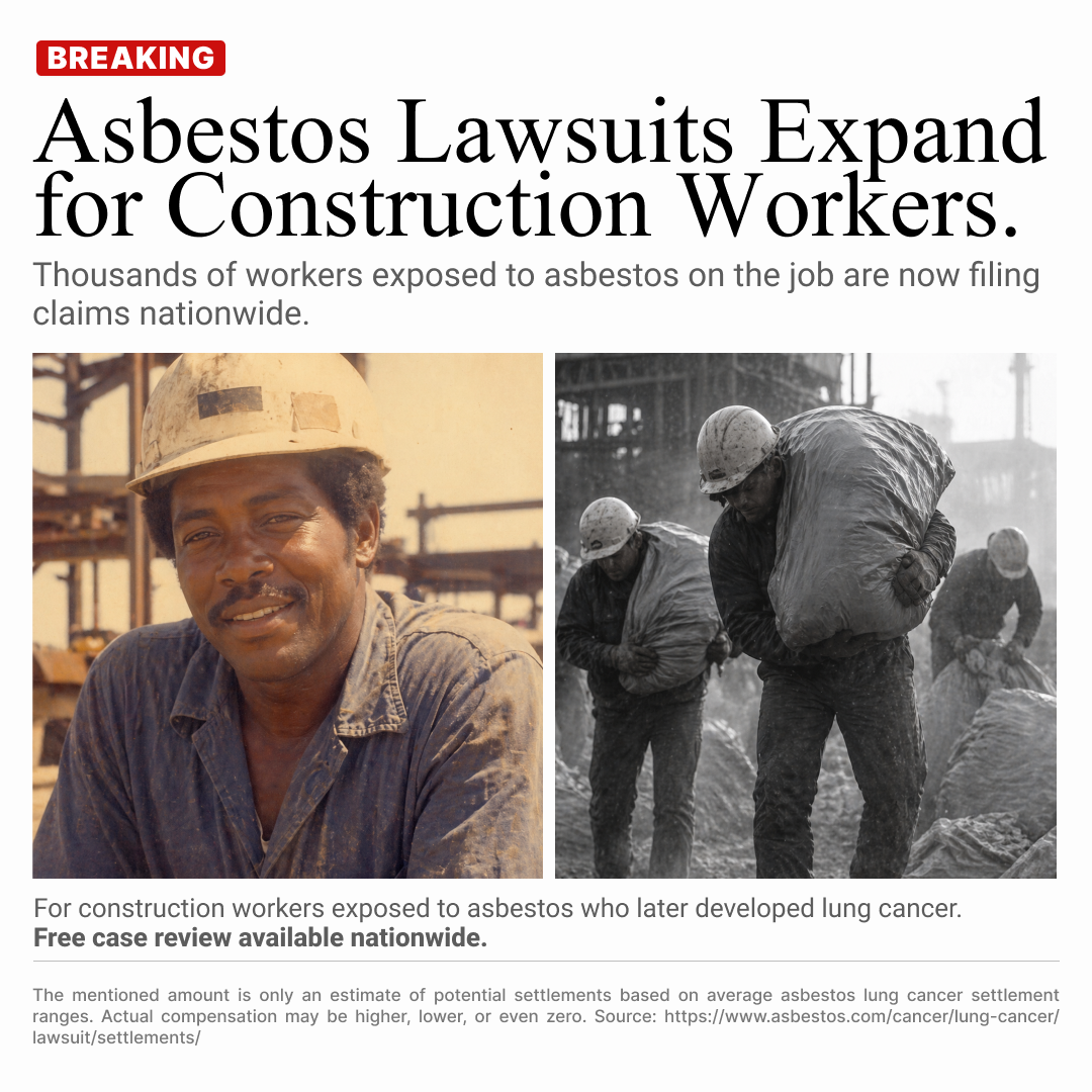
Same campaign, different entry point to #03. Where the official authority ad triggers self-ID through occupation signage, this one triggers trust through editorial news format. Men 60–80 who scroll past legal ads will stop for a news story. The format does the credibility work before the message even registers.
Breaking Badge → Editorial Headline → Caption CTA
Present-tense headline ('Asbestos Lawsuits Expand for Construction Workers') positions this as an ongoing news event, not a past story. Third-person, educational framing ('Thousands of workers...') avoids Meta's personal attribute restrictions while still speaking directly to the persona. The body caption qualifies without pressure: 'Free case review available nationwide.'
Design Decisions
Split screen is the emotional core: vintage warm-toned worker on the left ('that was me') and current asbestos-handling workers on the right ('this is what it did to us'). The time gap activates the cover-up narrative without stating it. Editorial typography, serif headline, grey subheadline, credit-style caption, completes the news article illusion. White background, black text: no glossy ad feel.
News Static
Distinct from Static Standard, layout mimics a real editorial article, not a social graphic. BREAKING badge adds urgency at the top. Split screen image is the center zone. Caption-style body copy and law firm credit line at the bottom reinforce the journalistic frame. Built for Facebook Feed primary, where the older 60–80 demographic has the most volume.

FOMO, The Cost of Waiting
This angle doesn't sell the product, it sells the consequence of not acting. 'Votre idée de SaaS dort dans vos notes depuis 18 mois' targets the guilt that every non-technical founder carries. '18 mois' is specific enough to feel personally accurate, broad enough to hit almost anyone. The threat isn't failure, it's irrelevance. Someone else will ship what you're sitting on, and the viewer already knows it.
FOMO Hook → Objection Removal → Low-Pressure CTA
The headline makes the viewer the protagonist of a story already in motion, and they're losing. 'Pendant que quelqu'un d'autre la lance' externalizes urgency without blame. The CTA 'Parlez à votre futur cofondateur tech' is framed as a conversation, not a commitment. The sub-CTA does the heaviest lifting: 'Sans prise de capital' kills the #1 objection before it's raised, and 'Réponse sous 24h' creates urgency without a hard deadline.
Design Decisions
The oversized headline puts the FOMO message in unavoidable type, it reads before the viewer decides to engage. 3D avatars and UI product mockups signal 'tech ecosystem' to a non-technical founder who sees themselves surrounded by builders. The purple gradient creates energy and forward motion, a direct contrast to the stagnation the headline describes. The date element adds temporal pressure without being a countdown.
Bold Visual-Led Static
Headline dominates the top zone at maximum size, text leads, visuals support. Sub-text picks up the value proposition below. CTA with solid background button contrasts against the gradient and anchors the action. This format reads like a product launch to a B2B SaaS audience, not an ad. Visual confidence communicates that the service is already working, you're the one who's late.